

Site Improvements
Addition of Wind Animation
Wind Animation is Live
The Problem
Wind arrows and barbs work, but they've always been a bit clunky to interpret at a glance. You see an arrow, you see a barb — but understanding how wind patterns flow across a region requires some mental assembly. I wanted something that clicked faster.
The Solution
I added animated wind particles to the map. Instead of static symbols, you now see wind flowing across the nearshore modeling layers in real-time. Direction and intensity become obvious immediately — stronger winds move faster, and you can trace patterns across the coastline without doing math in your head.
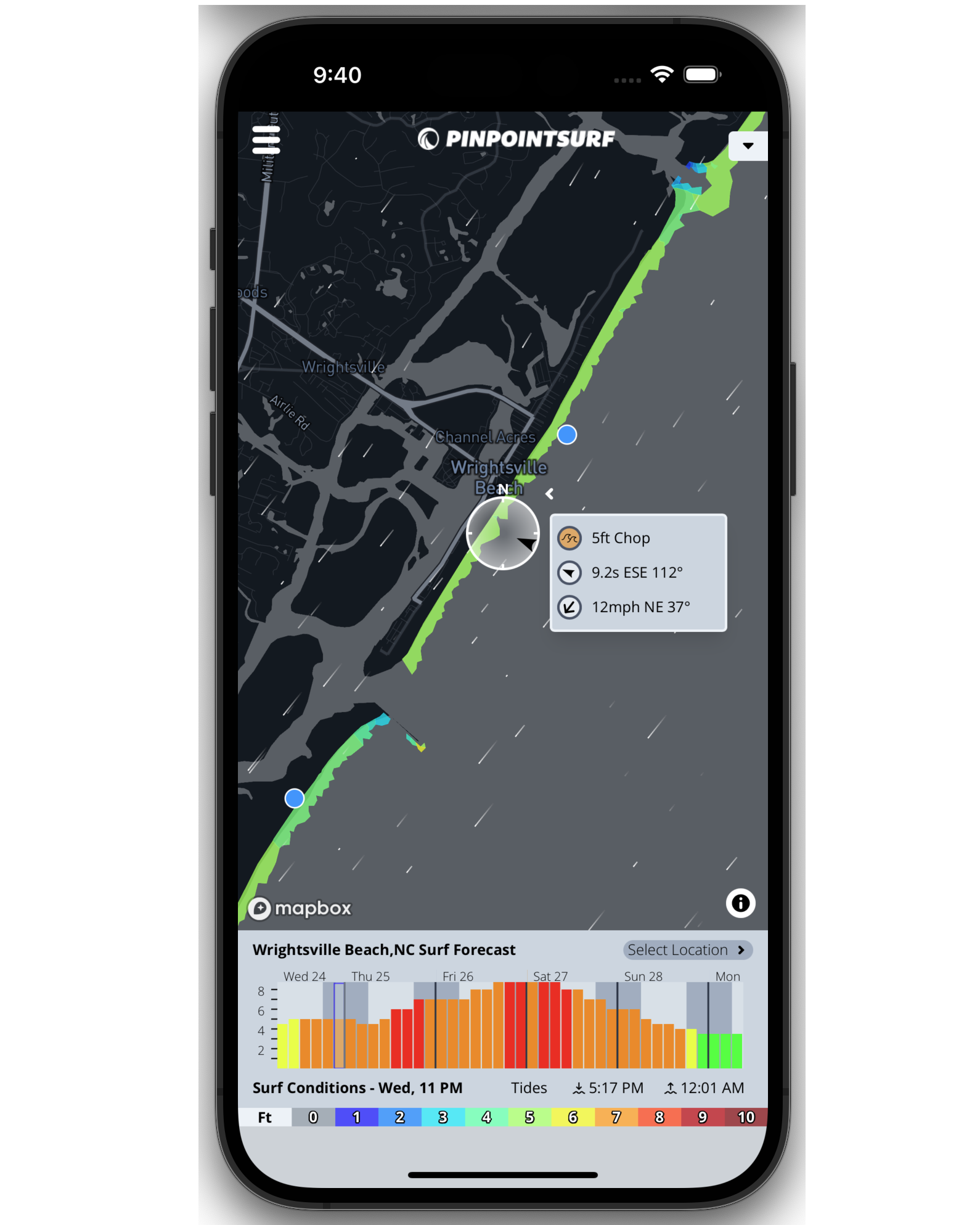
It's enabled by default. Load up the map and you'll see it running. If you prefer the classic arrows and wind barbs, just hit the layers dropdown and toggle back. Both options are there.
Why It Matters
When you're stacking wind data on top of the surf and swell layers, being able to see how everything interacts makes the whole picture clearer. Is that offshore breeze going to hold? Where does the side-shore start kicking in? The animation answers those questions faster than symbols ever did.
What's Next
This was a feature I'd been wanting to build for a while. I felt it worked well enough to release, but I'm curious what you think. If something feels off or you have ideas, let me know.
-Eric
Topics: Wave Modeling, Site Features