

Site Features, Wave Modeling
Everything That Is New
It's been a long time since I posted anything here. That's because for the last eight months, most of my nights and weekends have gone into rebuilding pinpointsurf from the ground up. The website, the model infrastructure, and a pair of real apps.
The models now run completely in the cloud, with some impressive speed and efficiency improvements unique to pinpointsurf. That was the piece that had to happen first, and it's what made everything below possible.
The scrolling chart is how you move through time
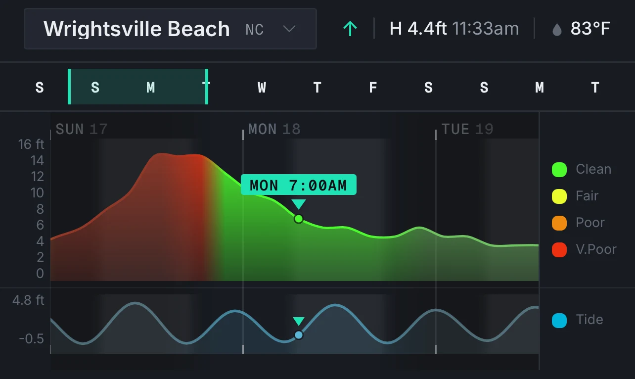
The old way of checking a specific hour was to hover, click, or drag along the chart to land on a time. It worked, but fell apart with longer forecast times on small devices.
On mobile and small screens, now the chart scrolls. Whatever time you stop on, the map updates to match, and so does everything else on the page. Pick a time once, and the map, every chart, and the tide curve are all looking at that same moment. Just push the forecast left and right with your thumb.
Four charts, not one
Surf height/quality was the only chart for a long time. Now there are four: surf, seas, swell period, and wind. Each one scrolls on the same timeline, with a compass strip underneath showing direction.
Switch between them and the selected time comes with you. Check the wind at 7 a.m. Thursday, flip to period, and it's still the same moment.

Tide
Tide is a real curve now, drawn from your location's nearest station, with the highs and lows marked. Intermediate times are interpolated from the curve.
Colors that mean something
I got a lot of feedback on the old color scheme. While the "Jet" colormap emphasized surf height differences on the map well, it collided with the quality colors on the chart. I spent a long time on this one, trying different color palettes and ramps. Ultimately, I landed on a blue-through-magenta ramp, which reads distinct from the surf quality.
The part I think is genuinely worth explaining: the wind, swell, and period charts and the map now use the same colors for the same numbers. The curve on the chart is painted with the exact color lookup the map raster uses, and the chart axes are deliberately scaled to where the map's colors saturate. Only the surf quality colors differ now.

On the map
Outside of the new layers, the bigger change is a completely new rendering pipeline. Tiles are rendered in a background thread now, so panning and zooming stay smooth while the surf layer redraws, and stepping through time doesn't stall the map. It's a completely different feel from normal raster maps. The amount of data over the wire is small, with the decompression and rendering done on the device.
Oh, and I almost forgot... There is now full global coverage of the GFS model output, past the regional zoom. However, surf and quality are still only available when zoomed in on the regional areas.

Buoys and spectra
This one is entirely new. Buoys show up on the map, and tapping one opens its actual observations: wave height, period, and wind, with the model's forecast line drawn right on top of the observed data. That comparison is something I've always done by hand when checking model performance, and now it's just there.
The part worth digging into is wave spectra. Instead of one number for period, you get the full energy distribution: how much energy is arriving, at what periods, from what directions. It's how you tell a clean groundswell from a pile of local windswell that happens to average out to the same height. Interpreting this feature is worth its own blog post, so watch for that in the future.

There's an app
pinpointsurf is now a real app on iOS and Android, not just a website you bookmark. Same forecast, same charts. You can also still install it straight from the browser if you'd rather.
Accounts came along with it, and you can sign in with Apple, Google, or create an account with your email. One subscription follows you wherever you use your account.

Free, ad-free, and Pro
The free tier keeps everything you had: 5-day forecast, 3-hour steps, every wind and wave layer, no ads. Nothing that used to be free went behind a paywall.
Pro is $4.99/month and adds a 10-day forecast, hourly detail through day 5, and full directional spectra and model output across the whole time range.
To be frank... The ad-based model wasn't working, and I'm not willing to sacrifice the product to chase clicks. However, every forecast cycle rents cloud computers and that bill arrives whether the surf was good that week, or not. The subscriptions help cover it, and they're the only way I can continue to run and expand this site long-term.
I don't have investors with venture capital that I answer to. It's just me, trying to build the best and most unique surf forecasting tool that I can. If you find it useful, I hope the Pro version helps make it even more so.
What's next
What's there now is the next step, not a finished product. My whole goal is to keep growing this thing and making the forecast better... better models, more coverage, faster updates. More of the tools I think can help us pick the best time, and location to surf.
Much more to come...
-Eric